4 assessment drawings

Foot drawing
|

Portrait
|

Alien Drawing
|

Town drawing
|
Colored Pencil Forms

|

|

|
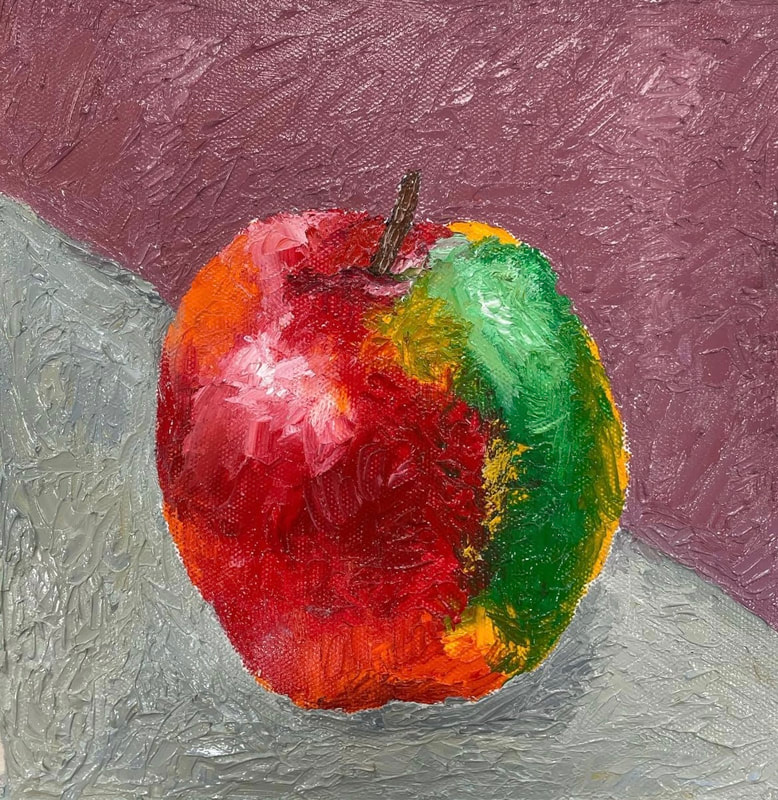
Colored pencil fruit or veggie

Watercolor value chart

Watercolor Fruit

Warm Colors
|

Cool Colors
|

Monochromatic
|

Pen outlined
|
Watercolor Nature Project

Final painting
1. Some watercolor techniques that proved helpful to me were starting off with a light base and slowly adding more and more layers until it became the color I wanted. Another technique I liked was the wet on wet technique it helped fill in space in the background and allowed it to look even.
2. Transparent layers were so important in my piece. Because of the softer colors in my painting I had to make sure not to start off my painting with harsh lines and colors. It also allowed me to change my mind on certain aspects of the piece as I go along with my painting.
3. I think my composition was successful. I think the small flowers in the front with the larger ones in the back help make the painting flow better.
4. Color choice definitely was important. If the colors in the piece don't flow together it can throw off the whole look of the piece.
5. For my butterfly I think i did good on my craftsmanship, I think I did good on the detail of the wings and the colors in them. I think my painting looks neat and not sloppy which I am proud of.
6. If I was able to do something different it would be to darken the stems of the flowers a lot, they seem to fade into the background instead of standing out the way I would have liked them too.
7. This has taught me a lot about watercolor. I've learned so many new techniques which I will take with me as I continue to make art. Overall Im so happy with my progress and how my painting came out and am excited to continue making art with watercolor

In
progress 3 
Final color sketch
|

in progress 2

Reference 1
|

in progress 1

|

Comp sketches
Acrylic Color Wheel

|

|
100 color challenge
|
Oil Painting practice project
|

Hundertwasser inspired acrylic painting
|
Refrences

Comp sketch
|

Prog 1

Prog 3
|

Prog 2

Color sketch
|


Final painting
1. I believe the craftsmanship of my painting turned out very neat and clean looking which im proud of.
2. My work embodies the artists style by the cartoonistic look of the piece and the use of repetitive shapes and designs throughout the painting.
3. The colors I chose to use in my painting were mainly blues, purples, pinks, and yellow. I did this to make my painting pop and give off an energetic and happy feeling with the bright colors I used.
4. The emphasis of my painting I think is the water, I think it stands out most in my piece and i'm really happy with how it turned out.
5. I used a great amount of repeating patterns in my piece especially in the water, sidewalk, and sunray's which I think made all the aspects of my painting tie together nicely.
6. I added the spiral into my painting with my trees. I actually really liked the way I incorporated it, it was subtle but ended up being a really nice touch in the middle of the more plain looking houses.
7. My biggest struggle with this project was adding layers and layers so you wouldn't be able to see the red under the paint. This was especially hard in the water because they were very thin precise lines and I had to continuously create the blues over and over to go back and touch them up.
8. Overall In extremely happy with how it all came out, the planning and revising of the sketch was so important so I knew my exact approach of my painting.
9. Something I have learned from this painting that I will definitely take with me with my next projects is to paint the background before anything else, this was something I failed to do and regretted as I progressed in my work.
Animal Portrait Oil Painting


|


|


|

1. I think the craftsmanship of my painting is neat, I think the lines are clear and clean and am overall really happy with my craftsmanship in this painting.
2. I used the elements of art in many ways with this piece, texture and value being my main focus. I used texture a lot while doing the fur of the bunny and also used value through out majority of my piece especially while making the ripples in the blanket.
3. The subject matter is my friend/fellow classmates bunny named Ginger. I chose this because I wanted to go outside of the usual dog and cat and do something I thought no one else would do and I think Ginger was the perfect subject for this.
4. My emphasis was defiantly Ginger, I wanted to make her the center piece of my painting and have everything else fall into the background.
5. used texture to enhance my work mainly in the fur, I tried to make it look more realistic and show the different colors and layers throughout the fur which I think truly brought my painting to life instead of making it look dull and flat.
6. I think my final painting is really successful, I'm actually really proud with the outcome of it. I think learning how to paint the dog eye helped a lot for me to understand how to be able to show layers in the fur and how to add the dark's and light's throughout it.
7. I had a love hate relationship with oil paints. I love the texture of the paint and the way it glides across the canvas and blends together but I was constantly frustrated with how long it took to dry. It was a big obstacle having the whole canvas wet and having no place to set my hand while I paint a different section, I continuously smudged my painting but that Is something that will just take more practice for me and something I can overcome while working with oils in the future, which I plan to do.
8. My biggest difficulty was probably time. I feel like If i had more time with this piece I could have fixed a lot in the background that I wasn't as happy with. The only changes I would make would probably be to the pillows, I feel like compared to everything else they look extremely flat.
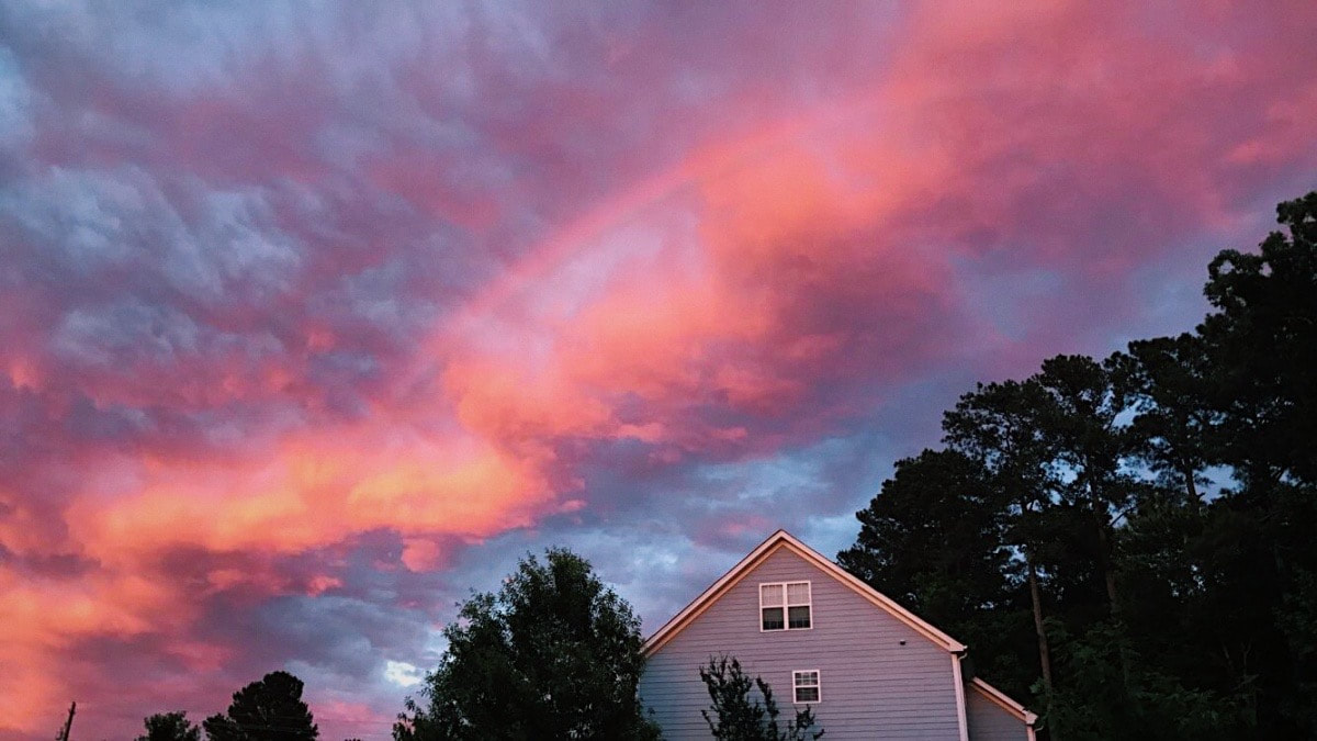
Landscape Oil Painting

|


|

|

1. For this being a palette knife painting I think the craftsmanship was decently neat, I think there is defiantly room for improvement though.
2. For color I wanted to use bright/vibrant colors for the sunset to really show hoe beautiful it was and to make it be the focus of the painting.
3. I created contrast with the vibrant colors in the sky and the darker, duller greens within the trees surrounding the house.
4. I used texture throughout the entire piece with the palette knife and within the trees by adding a lighter color to show the layers in the leaves. I also used value in the house by adding the shadow that were made by the trees.
5. I created depth by the shadows on the house and the detailing of the trees/bushes.
6. The painting techniques I used were putting down my base colors and then using the palette knife technique over top of it.
7. I had a lot of difficulties with my painting, my main one being to keep my motivation to continue using the palette knife. I had trouble mixing the colors how I wanted with it and was close to quitting and finishing my painting with a brush. To improve my painting i would 100% use a duller color for the blue in the sky, I think the color was way to vibrant and puts a strain on your eyes.
8. I think I did the texture of the trees really nicely and that Is what I'm most proud of in this piece.
Final Course Reflection
During the duration of this semester I have grew so so much as a painter. I came into the semester only really working with watercolor and wanted to expand my skills with that and also try out some new mediums but wasn't hopefully that I would be any good at them or want to continue using any of them outside the course which I was completely wrong about. I learned how to use acrylic and oil paints and had so much fun with them and the different techniques with both types of paints. I am surprisingly really happy with the painting that I've made using both mediums have bought the supplies and plan on using the techniques I've learned in class to create my own work at home! I've learned about the importance of layering, texture, value, color, and perspective which have helped me immensely to be successful this year. Another thing that really helped me in class was doing the mini projects, It got me comfortable with working with the mediums and made me feel more confident about going into the bigger projects. Overall I've learned so much this semester and am really happy with how I've grown and progressed as a painter!
