4 Assessment drawings
Done in drawing 1
"Unseen Things" Final Project
|
|

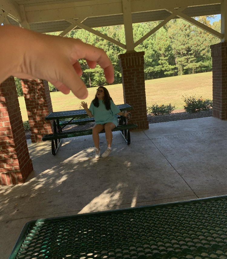
Reference photo

Brainstorming ideas

3 comp. sketches
|

Progress photo

Final sketch
|

Progress photo
The process I went through to do my drawing was I first brainstormed my idea for the piece, then I took my photos, then I made 3 compositional sketches, then picked my favorite one and made my final sketch, then began the final drawing. Composition was very important to the success of my drawing, finding a way to make everything look pleasing in the photo was hard to accomplish. I had many different values in my object from almost pure white to a harsh black. Personally I think I did a good job at achieving full range of values. I think I hit the very dark colors which was hard to do. I think It was done neatly, I could have made cleaner edged though. It was important to learn how to shade correctly before this project so that the colors flowed nicely. I think I grew as an artist by pushing my limits on values. One obstacle was defiantly doing the shelf and having to shade it very very lightly to get the white color.
|

Final drawing
Shaded Forms
Today in class we learned out to draw and shade 3D shapes.
|
Value chart
In class we learned how to make a value chart and ease our way from the darkest value to the lightest.
|
9 Compositional Pictures

Pen video drawings

|


Pen stippling worksheet and value charts
|

|


Forced perspective
|

|

|
|
|
Pen perspective Project

Comp Sketch

Progress pic #3
|


Progress pic #1

Prog. Pic #4
|

Final drawing

Progress pic #2
|
1. The way I chose which pen technique to use was if it was a larger space that required a lot of texture I used cross hatching, I used this in a majority of my piece. For the blanket and the pillow I used stippling to have some contrast from the rest of my drawing.
2. I used perspective by the view you see the girl from. Because I based her off of sleeping beauty I used the perspective of the prince looking down onto her.
3. I used texture so much in this piece. Especially for the hair and the mattress, I used texture in the hair to make it look more and alive rather than just flat I used texture on the mattress to try to show the dips in the mattress where it sinks into the buttons.
4. Value is so so important in this project because since we are working with pen it is so much harder to create those value changes and depth in the piece. Knowing how to ease up on the pen and create lighter lines was so helpful to me during this project, especially while doing the face and facial features.
5. I think my craftsmanship was pretty good, for using pen I am very very happy with how the face turned out in this piece. I struggled a lot doing the hair but again I am proud overall on how that turned out. What I could have done better in my craftsmanship is defiantly the bed, I was having a very hard time navigating how to go about making it and think I could have come up with a better looking design.
6. Again what I would do differently would defiantly be making the bed look different, I'm not happy at all with how the outside of the bed looks and If I were to do this project again that is 100% what I would work on the most to fix.
7. The fairy tale my piece was based on was Sleeping Beauty. The was that I made this my own was I changed her appearance and her bedding but I still tried to make her look elegant and drew it from the perspective of the prince looking down on her In the scene when he finds her asleep and gives her the kiss that wakes her up.
8. It was very important to remember the techniques we were taught in class because learning how to do different values is extremely important when working with pen to create dimension within your piece.
9. Growing as an artist I think learning about the different pen techniques will be important, I'm not as comfortable with stippling but I think it is a great technique to use so for the future that is something I will defiantly be working on!
O'Keeffe Project

Brainstorming ideas

In progress #2
|

Comp sketch

Final drawing
|

In progress #3

In progress #1
|
1. The pencil techniques that helped me during this piece was being able to control the value in my pencil, because my piece was primarily one color I had figure out how to show depth within that one color.
2. Using layers with the colored pencil was important because the fact that my piece is one color I had to use many layers to create any depth within the piece.
3. I think my piece could have been more successful, I think by making the background darker and making the raspberries in the back darker it would have maybe looked nicer.
4. Yes, color choice was important because my project was all one color so I had to find other colors to layer on top of it so it didn't look dull or flat.
5. I used my knowledge of her for this piece by trying to make something bright and somewhat abstract.
6. I think my craftsmanship could have been neater, I think the raspberry on the bottom could have been a lot better with more even lines on the berries.
7. If I was an art critic I would say it needs more depth because it looks pretty flat.
8. If i were able to do something different it would be making the background darker and fixing the bottom raspberry.
9. What I learned is i need to use more layers in my work to make it look for alive, I feel like this piece looks kind of lifeless to me which is a little discouraging but I think that is something I can work on and fix in the future.
Water color forms and peppers


|


|
|
|
|
Collage Project

Progress #2

Reference Picture
|

Progress #3

Brainstorming ideas
|

FINAL COLLAGE

Progress #1
|
1. I chose this subject matter because Italy is the place I want to go most in the world and I find it absolutely stunning and thought it would a great piece.
2. I think my proportions were accurate but I think my shading could have been better especially on the plants.
3. I used texture in the wall of the building by using different variations of neutrals to try to make it look less flat and I also used pictures of pools with waves in it for the water to make it look more real.
4. I wanted a more abstract piece so for my picture I tore off pieces and fit them together to create the shapes I wanted.
5. I feel as though I did okay with range in my piece by trying to create shadows and a range of colors in each part of my piece.
6. I think my craftsmanship could have been neater but I like how it turned out with the harsh lines.
7. I could improve my artwork by outlining my shapes more and adding more shadows in my piece.
