My Drawings
4 Assessment Drawings
|
This is my portrait picture I used a graphite pencil and a white pen for the highlights.

|
This is the picture of the hand I drew

|

my drawing of shoe with laces i used a graphite pencil and a black pen
|

My city scene picture |
Value forms and value chart

This is my value forms and my 9 step value chart, for each shape and the value chart I used a HB pencil art pencil.
Photography project

This picture represents the stress of school starting and my lack of energy through the day now. The way I used color was by making my picture black and white to make the picture seem more serious. I used variety by showing all the binders and papers around me to help better show the stress of school. What I found successful about my piece was I think it represented my topic nicely, I think I could improve on how I edit the colors of the picture.
|
I took this picture of my volleyball bag because since corona started I haven't been able to play volleyball which has been a really big part of my life for the past couple years. The way I used space in my picture is by taking up the majority of the picture with my item. I used pattern in this picture because you can see the square textured pattern on the bag. what was successful about it was I took a picture that represented lots of personal importance to me, I think for next time I could have zoomed out more on the picture or added more to it.

Still life pictures |
This picture represents the new life of school during corona, this is the place I use to do all my homework and is now where I spend my entire day. I think this represents shape because in my picture you can see the sharp shapes of the shares on the computer and the rectangle in the sketchpad. I think this shows emphasis because I made my computer the focus item of my picture because it is the most important and is the main thing I use for school now. In this piece I liked the way the light stretched across the majority of the picture I think it brings a cool effect on the image.

|

|

|

|

|

|

Modified Contour hand drawings
We did a contour drawing of our hand where we cant pick up our pen while we draw

|

|

|
Blind contour hand drawings
Today we did a blind contour of our hand where we were not allowed to look at our

|

|

|
Contour drawings of a bag and a shoe
Today in class we made contour drawings of a bag and a shoe

|

|
Value chart, spheres, and ribbon drawing of black paper
I used white prisma and charcoal pencils on black paper to create a value chart, 2 spheres and a ribbon drawing.

Final Still life project

Critique questions:
1. My craftsmanship is okay, I think there are some smudges that could have been blended better but other than that I think most lines were clear.
2. I think yes that my values were realistic I think I did a good job on highlights and making those stand out.
3. I think that there is a clear direction where the lighting is coming from.
4. They are important so you get a clear idea of the final drawing and know exactly what you are planning to do so if you don't like the idea you can change that.
5. I think it's successful with the shading and highlights.
6. Yes i think I did the proportions correct.
7. I think I could have done a better job with placement but I don't think it looked awful.
8. I think the center focus is either the Polaroid or the plushie on the side.
9. I think I could improve my time management for this project because I felt a bit rushed making it.
10. I had a challenge with the shading on the football to make it look textured.
11. I've learned the importance of placement and how that can change the look on the image.
Perspective drawings

|

|

|

Forced perspective

Look what I can see through drawing |

|

1. I think my craftsmanship was okay I think it could have been more neat though.
2. I created the look of transparency by the use of highlights. 3. I put these colors together because I liked the way the pink looked in the middle with blue on each sides. 4. I created contrast by the different levels things were set at. 5. I used highlights to create the illusion of transparency and shadows to bring everything to life. 6. Its important so you know how to blend the pencils together to achieve the desired look. 7.I had trouble on the animal to the left and showing the textured fur. |

|
Look at that view


|


|
1. I created an interesting point of view by the angle I took the photo from so you can see everything.
2. Its important to understand perspective because it can change the way your piece looks, if you have an interesting perspective you have an interesting drawing.
3. They helped with shading and highlights to make the drawing more realistic.
4. For this piece I struggled a lot with drawing the leaves of the plant other than that I think it turned out really well and I matched the perspective nicely.
5. Yes, I think I was able to achieve perspective in my piece and I think it turned out good, I was very happy with how it turned out.
Facial Features Drawings
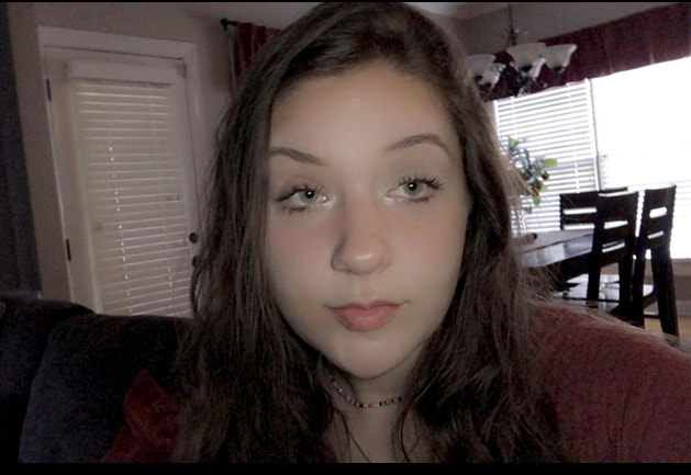
Reference picture of face
|
Drawing of face

|

Drawing of mouth
|
Drawing of my eye

|

Drawing of my nose
|
Colored pencil forms

|

|

|
Colored pencil veggie |
Pastel eggs |

Pastel forms
|

Wrapped candy
|
Self Portrait project
|
Final self portrait drawing


|


|
The process I went through for my drawing was I first printed a picture of my reference so I could pick each feature apart and draw it and I started with the eyes then moved to the nose then mouth and shaded the cheeks and forehead after. I drew myself as a fairy. I think I was close to full range in value the only thing I think could have been better was the hair. I think my craftsmanship was neat for the most part, I am pretty proud with how it turned out. I made sure the facial features were in the right place by making lines on the reference picture and doing those same lines onto my piece to mark down where each feature goes. Its important to learn how to draw each feature individually because if you don't know how to do one feature it can mess up the whole drawing and take away the realism that you are trying to achieve. The most beneficial for me was learning the nose because that's something iv'e always struggled drawing and I am actually really proud of how my nose came out in this drawing. My biggest obstacle was definitely the hair, I always have a hard time drawing hair. I think the hair just could have more of a range of value if I did this project again.
